I find Wolfgang Tillman's method of installation particularly inspiring - especially the last image (Maureen Paley) where hues of colour seem to lead the arrangement.
Showing posts with label research. Show all posts
Milton Avery Beach studies
Milton Avery beach studies - influential on own beach studies from dungeness - heightened colour palette / contrasted tones / simple forms to create landscapes
Vivianne Sassen at ICA
film: Carl Theodor Dreyer's The Passion of Joan of Arc 1928
Looking at the use of close up and high contrast shots
Almost all the shots in the film are compromised of close up facial shots - expression mutating naturally - close up shots of lips speaking etc.
Scenes take place in very similar, blank setting - focus is on emotion/facial expression
Facial expression/high contrast imagery especially important as the film is silent and therefore all emotion must be conveyed through the face alone - heightened emotional responses
A few dialogue inserts to convey plot
cut-up / word collage
Manuscript for cut-up sent to Charles Plymell for use in NOW NOW NOW
Looking at William Burroughs use of the cut-up technique in his writing - creation of poetry through collage & vice versa
Initial concept taken from Dada artist/poet Tsara: use of newspaper articles - W.B and friend, painter, Brion Gysin start to use their own manuscripts & tape recordings to create these word collages.
Looking at using these word 'cut-up' collages as stimulus for paintings/physical collages
Placement
Nicole Werner, Rockdispenser 2010, Stainless steel, rocks, fittings
Morgan Fischer, Red Boxing Gloves / Orange Kitchen Gloves, two channel video: Polavision cassettes transferred
to DVD, November 2014 Maureen Paley Gallery
On his work as a 'double portrait': (text from press release)
"Red Boxing Gloves / Orange Kitchen Gloves was shot in 1980 in Polavision, an instant movie format that the videocassette made obsolete. The work is in the form of a pendant pair, a convention that arose in seventeenth-century Holland. The pendant pair consists of two paintings with subjects that are complements of each other. In the classic case one painting shows a husband and the other his wife. Together the two figures make a larger whole. The two pairs of gloves express this same relation in figurative if conventional terms."
Paul Lee: materials
Paul Lee, Untitled, (can sculpture), 2011 / Paul Lee, Untitled (cut towel), 2011, towel, thread, ink, steel, wire hoops / Paul Lee, Untitled (cut rock), 2011, plaster, ink, paint
Looking at use of interesting/unusual material: cans, pebbles, towel
I'm A Born Liar, Fellini
Stills in notebook, taken from the documentary Fellini: I'm A Born Liar by Damian Pettigrew 2002
subtitles/text read: "Even though a film is very complex to make, it can actually exist in a sensation, in a premonition. It can come from a beam of light, a sound. That's a well-know debate about art...That a work of art can be foretold, announced to its creator, even through a perfume. All of life can be suggested to a lifeless creature that wants to live. It can be suggested by the trembling of a leaf!"
A film of One's Own
A Film of One's Own [Fugue Solos] (2005) from louise curham on Vimeo.
4 channel video installation developed for Reeldance video installation at Performance Space, Sydney 2005, subsequently exhibited at the NZ Film Archive, Wellington and Te Manawa Art Palmerston North, NZ 2006. This work distresses and reworks footage from the film 'Slipped' (1997). Credits for Slipped: director Louise Curham, choreography Sue Healey, producer Peter Kaufmann, cinematographer Mark Pugh, dancers Michelle Heaven, Phillip Adams, Belinda Saltmarsh and Michael O'Donoghue.
"Louise Curham is an artist and filmmaker, who sees “Film as art.” Sue Healey is a choreographer who is interested in translating dance onto film. Their collaboration resulted in this tribute exhibition of dance, interlaid and overlaid delicately with film fragments from live performance, outtakes and trims. Curham then applied her shtick, physically treating the film, applying surface scratches, paint and ink. The result is a beautifully moving series of image and dance; art come alive on the canvas, of which we walked into – a black room projecting the film off walls, columns and footstool sized black boxes."
text from article on ThreadNz by Sally Christie (2006)
Painting taking the form of film: shots cut/spliced together, film treated or scratched to give it different qualities, overlaying and placement of clips to create moving collages
Sarah Sze Newspaper Series
Collage / Cut - Out
“After years of organising [the photographs] in a logbook I realised I was making very conscious decisions about where I was placing each frame,” she says. “After that, I started cutting into pictures from a series of photos about wrestling. This impulse came because I wanted to escape the boundaries of the ‘where’ and the ‘what’ the photos were. The specifics of photography can be overwhelming [so] to cut out and rework the figures gave me a better way of talking about what I was truly interested in which was movement, performance and historical, religious paintings.
“I am most thrilled when things start by the accident of proximity and seeing two pieces together creates a dialogue that can be asserted by decisions that involve cutting out or pasting upon. In terms of surrealism, it is the desire to have punctuation, subtext. To create a work that is in itself a conversation or argument.”
Leigh Ledare Air Freshener 2010
Materials
Katy Moran If We Don't Have It You Don't Need It / Panther Cat 2011
Painting directly onto glass, layered above canvas - creating dialogue between the spaces/layers
"Can you control it?
Painting's exciting - it's about pretending you are out of control, trying to introduce accident, chance and things that are unplanned that interest and surprise you more than anything you have consciously or intellectually conceived. Being the only person making the work means I am ultimately in control. I am in charge of every decision made.
Moran’s paintings are expressive, becoming something entirely different from their subjects. Her works are piled with other elements such as inlays, cut-outs and torn paper. The elements she adds work in layers of narrative."
Words from an interview with Phaidon
Questions of materials to use/experiment with during FMP: Platonic Solid (detail), 2009, plaster powder, powder paint, sugar paper, chalk, lipstick
Installation work: physically creating lines/space within a pre-existing context- lines that change as the viewer walks around space
Words from Art In America Lisa Le Feuvre (review of Modern Art Oxford Show)
colour palette: blue : image essay
Derek Jarman Blue 1992 / Georgia O'Keeffe Tent Door At Night 1915 / Teorema 1968 dir. Pier Paolo Pasolini / Louise Bourgeois Ode L'Oubli 2004 / Detail of a Sponge Relief at the Opera House 1959 Yves Klein
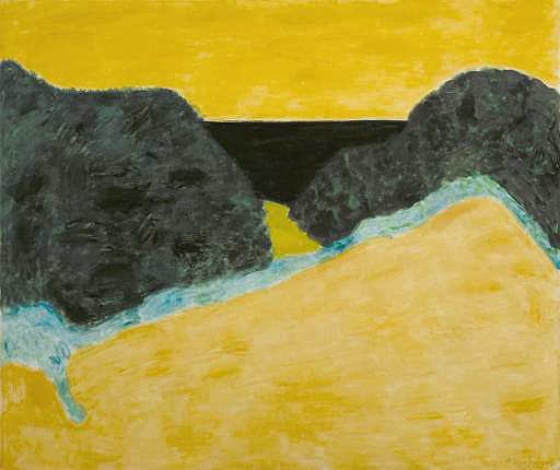
"After having gone through several periods, my research has led me to paint unified monochrome pictures. My canvases are therefore covered by one or several layers of a single color after a certain preparation of the support and using various technical procedures. No drawing is visible, no variation in hue; there is nothing but the UNITY of a single color. The dominant invades the entire picture, as it were. In this way I seek to individualize the color, because I have come to believe that there is a living world of each color and I express these worlds. My paintings, moreover, represent an idea of absolute unity in perfect serenity; an abstract idea represented abstractly, which has made me rank myself with the abstract painters. But I hasten to point out to you that the abstractionists do not understand it this way and they reproach me, among other things, for refusing to provoke relations between colors. I think that the color "yellow," for example, is quite sufficient in itself to render an atmosphere and a climate "beyond the thinkable"; what is more, the nuances of yellow are infinite, leaving the possibility to interpret it in many different ways.
For me, each nuance of a color is in some way an individual, a being who is not only from the same race as the base color, but who definitely possesses a distinct character and personal soul.… Nuances can be gentle, evil, violent, majestic, vulgar, calm, etc. In sum, each nuance of each color is definitely a "presence," a living being, an active force which is born and dies after having lived a sort of drama of the life of colors." Yves Klein on The Nuances of Colour
Subscribe to:
Posts (Atom)